
Case Study — Harmoney
Harmoney: Turns a handshake into a payment, so people who earn in person can get paid in the moment.
A tap to pay NFC card and companion app for vendors, creators and operators. I designed it end to end with Anthem Nation in New York, from first principles through to a production ready product.

Client
Anthem Nation
Founder
Tyi Moncrieffe
Role
Product Designer
Industry
FinTech/Payments
What is it
A physical card that carries your business. Tap it to any phone and your Harmoney profile opens in the browser, ready to take a payment. Nothing to install, nothing to spell out, nothing to remember later.

The opportunity
When someone says yes in person, the intent to pay is at its strongest. Today that intent has to travel through several steps before money moves. Every step it survives is value kept, and that is where Harmoney does its work.

What already exists, and the space between

The same ninety seconds, twice
Harmoney does not remove the payment step. The payer still opens their phone and authorises, and that step should take a deliberate action. What changes is everything that happens before it.

How it begins · identical either way

From here, one of two things happens
Without Harmoney · four days, no booking
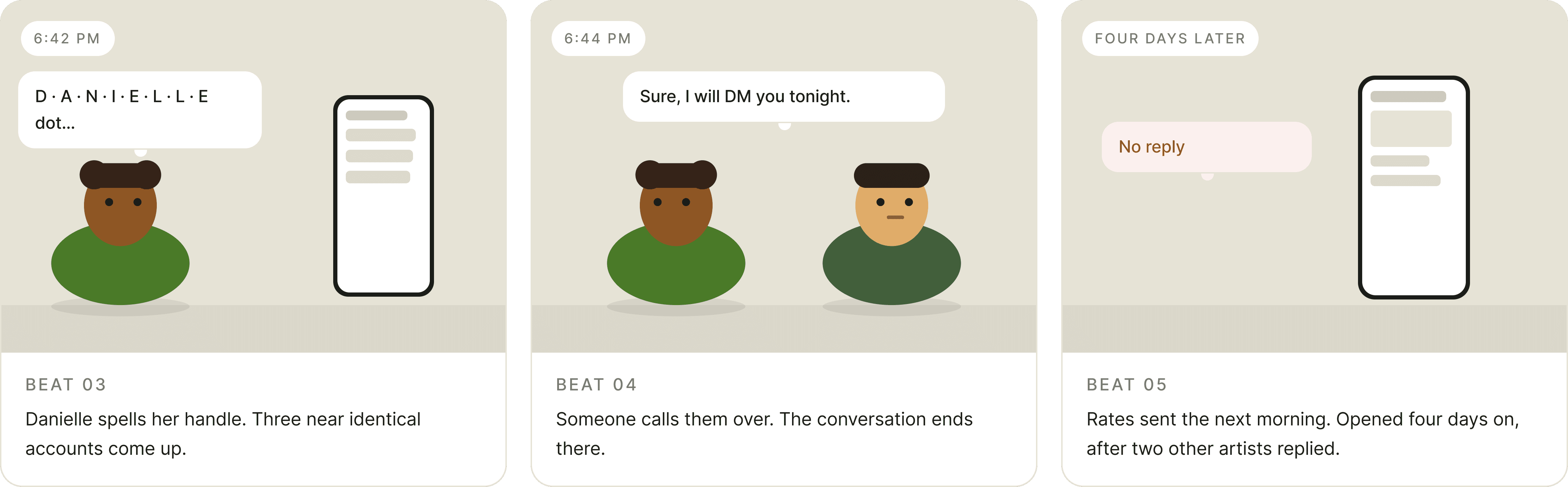
Nothing went wrong. Nobody was rude. The booking quietly evaporated between "I will DM you" and Thursday.
With Harmoney · under a minute, deposit taken


What actually changed


What Harmoney does
It collapses discovery, identity and payment into a single physical gesture, performed at the moment intent is highest.


Project goals
Agreed with the founder before design started, and used to settle every scope argument after.

Who it is for
Three earner types plus the person nobody designs for. Built from the founder market knowledge and the presale audience, and labelled proto personas because at this stage they are informed models, not validated research.

User journey map
The Service Creator, current state against designed state. I mapped all three earner types, and this is the one that offered the most to design for.


User stories
Written as acceptance criteria I could design against and a developer could build against, but held to a person so the requirement never got separated from its reason.


The principles we agreed on
Five principles, agreed with Tyi before a single screen was drawn. They gave us a shared way to settle questions quickly later on.

Ideation
Three structural concepts before any pixel was styled, run against the same story: take payment from a stranger in under ten seconds.
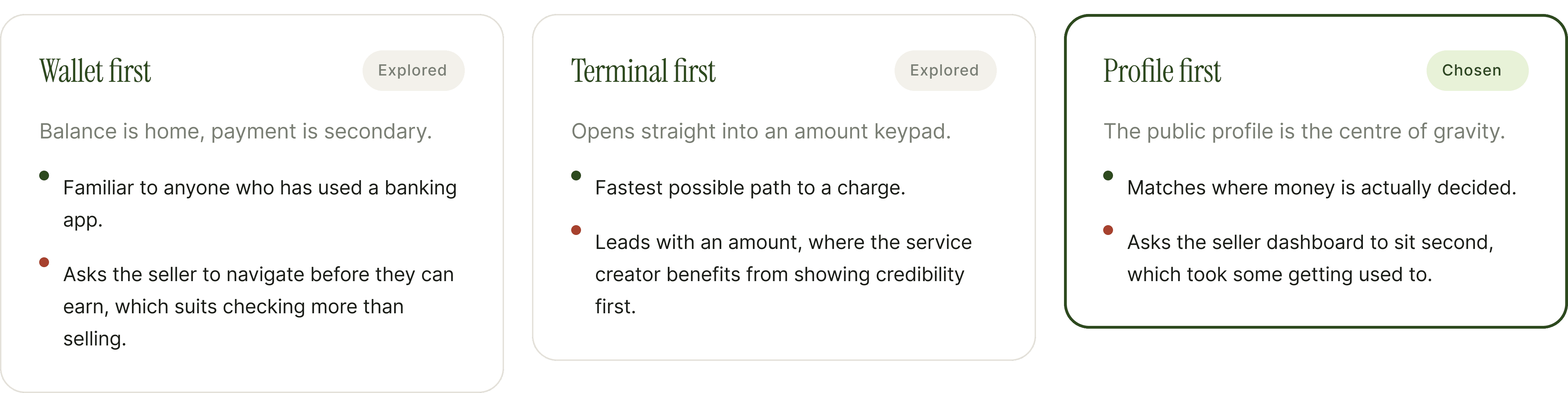
The seller already believes in it. The payer is deciding in the moment. Design effort goes furthest where the decision is still open.
Wireframes
Structure and hierarchy resolved in greyscale, with the reasoning annotated on the artefact so it survived review without me in the room.

Lo-fi
Layout and density resolved at full detail with colour deliberately withheld. If a screen does not work in grey, colour will not save it.


Visual direction
Colour applied last, on structure already argued and settled. Deep green carries navigation, the card and identity. Lime is held back for the single highest intent action on any screen.

The product
Forty six screens across two themes, covering onboarding, the money flows, links, the card, settings and every state in between.
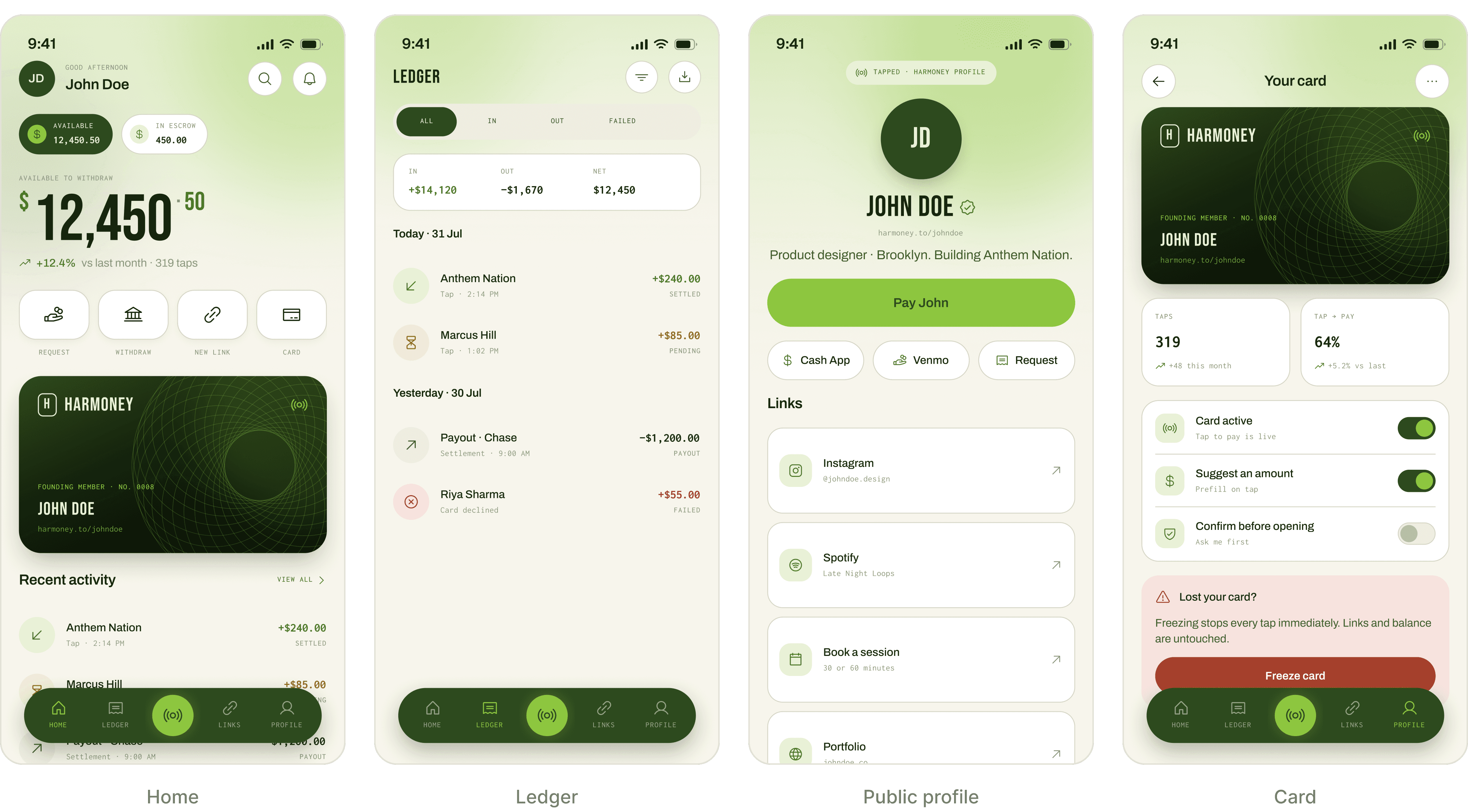

Decisions and the thinking behind them
A few choices worth explaining, along with what each one traded.


Every state is designed
In a payments product the quieter states are not edge cases. They are where trust is built.

Accessibility
Considered during design, not audited afterwards. Where it is not resolved, I have said so.

Reflection
The brief opened up into something bigger.
The starting point was a set of screens. Working through it with Tyi, it became clear the more useful contribution was defining what the product was for, who it served, and which moments carried the business. He gave me the room to go there.
Holding colour back paid off.
Working in greyscale through wireframes and lo fi meant every hierarchy question was answered with structure. Two things surfaced there that would have been easy to miss later.
What I would add next.
Not more screens. Five conversations with working vendors would test three of the assumptions this work is built on, and I designed those parts to be easy to change for exactly that reason.

Latest Project

