
Case Study — Vesseli
Vesseli: A seamless maritime hiring experience for boat owners and crew
Vesseli is a mobile platform designed to help boat owners hire crew and coordinate maritime work. I collaborated directly with the CEO, Laurence, to redesign the existing app and improve its usability, structure, and overall experience.

Client
Vesseli, UK | Lawrence McRory
Role
Product, UX/UI Designer
Duration
3 Months
Industry
B2B2C, Maritime
Background Information
Vesseli is a maritime platform designed to help boat owners hire crew, coordinate vessel deliveries, and manage short-term maritime work.
I collaborated directly with the CEO, Laurence McRory, after reaching out to him when he was looking for design support to improve the existing app.
The original product had a clear vision but lacked usability, structure, and engagement.
The goal of this redesign was to transform Vesseli into a platform that users not only understand but actually enjoy using.
The opportunity is significant:
The global maritime industry is worth hundreds of billions
Increasing demand for flexible, short-term crew hiring
Lack of modern, user-friendly digital solutions

Feed
Boat
Problem Statement
The existing Vesseli app suffered from:
Unclear navigation and user flows
Lack of visual hierarchy and consistency
Low perceived trust due to unstructured profiles
Minimal engagement due to a purely functional interface
As a result:
Users struggled to complete key actions
Hiring decisions lacked confidence
The app did not reflect its true potential

Project goals
Redesign the app to improve usability and clarity
Introduce a strong, cohesive visual identity
Simplify hiring and coordination workflows
Build trust through structured information
Create a scalable foundation for future development
Prioritizing the problem
Given the early-stage nature of the product, I focused on:
Core Hiring Flow:
Ensuring users can discover, evaluate, and hire efficiently
Onboarding & Role Clarity:
Defining user intent early to reduce confusion
Trust & Profile Structure:
Making it easier to assess credibility
Navigation Simplicity:
Reducing friction across key journeys
Research & Insights
Approach:
Discussions with the founder
Analysis of existing product experience
Competitive review of maritime and gig platforms
Key Insights:
Users rely heavily on trust and reputation
Lack of structure leads to hesitation in hiring.
Simplicity directly impacts action-taking
Visual design influences perceived credibility


Usability Tests
I analyzed the experience of Seapeople app, a competing platform in the maritime hiring space.
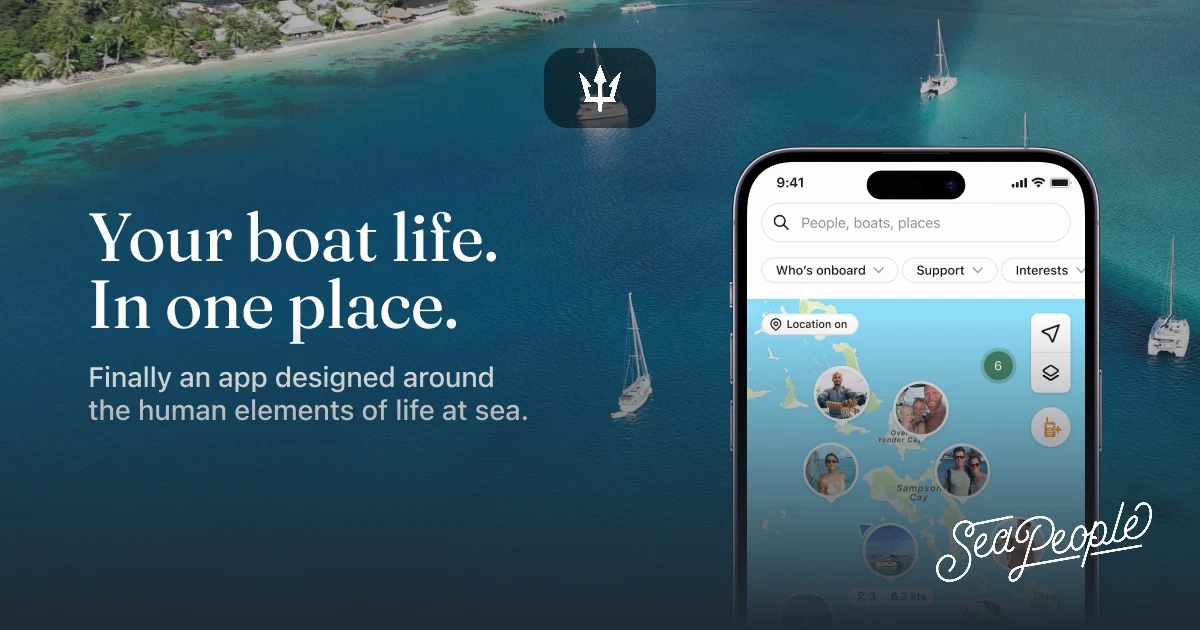
Usability Test - SeaPeople App
“It’s useful, but I’m not always sure who to trust or how to choose the right person.”
Testing revealed that while the platform enables hiring, it lacks clear trust indicators and structured profiles. Users struggle to confidently evaluate crew members, leading to hesitation and slower decision-making. The absence of strong visual hierarchy and credibility signals increases cognitive load and reduces overall engagement.
Requirements
Core requirements defined by Laurence were to:
Enable boat owners to hire crew efficiently
Allow crew to showcase experience and availability
Support delivery skippers and service providers
Keep the experience simple and mobile-first
Ensure the product feels professional and reliable

User Segments Identified
Boat Owners – Hire crew and manage operations
Crew Members – Find jobs and build reputation
Delivery Skippers – Manage vessel transport
Service Providers – Offer specialized services
User Persona
Boat Owner (Primary Persona) Goals:
Find reliable crew quickly
Evaluate credibility with confidence
Manage hiring without friction
Pain Points: Lack of trustworthy information
Time-consuming communication
Unclear hiring processes
Needs: Clear profiles Simple hiring flow Strong trust indicators

Solutions
1. Role-Based Experience:
Introduced structured onboarding to define user intent early and personalize the experience.
2. Trust-Driven Profiles:
Redesigned profiles to include:
Experience
Credentials
Availability
Clear hierarchy of information
3. Simplified Hiring Flow:
Reduced complexity in:
Searching
Evaluating
Requesting
Confirming jobs
4. Visual Identity Revamp:
Introduced a beachy, harbor-inspired theme to:
Reflect the maritime context
Create a calm, engaging experience
Improve emotional connection with the product
Design System
I maintained the design system to the range of having the beachy vibe and not compromising on the main color as per the client's requirement.
Try hovering over it!
I maintained the design system to the range of having the beachy vibe and not compromising on the main color as per the client's requirement.

Design
Before vs After
Before: Generic, utility-driven interface Weak visual hierarchy Minimal engagement Confusing navigation
After: Clean, modern mobile UI Strong typography and spacing Clear navigation and structured flows Cohesive maritime-inspired visual system


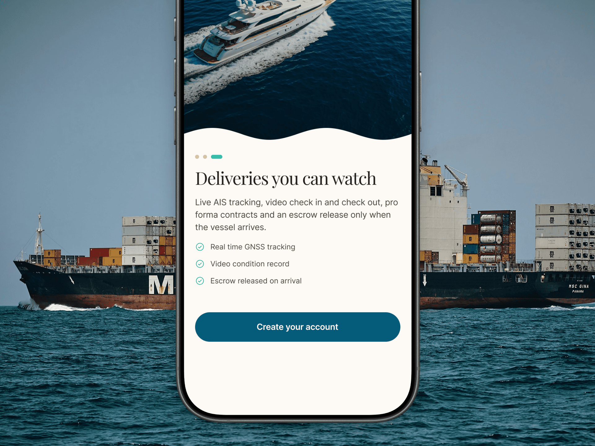
Key Design Improvements
Clear onboarding flow with role selection
Improved card-based layouts for profiles
Stronger CTA visibility
Better spacing and readability
Consistent design system
Conclusion
This redesign transformed Vesseli from a functional but underwhelming product into a structured, engaging platform with clear usability and strong visual identity.
The new experience:
Improves clarity across key workflows
Builds trust through structured information
Creates a more engaging and modern interface
Lays the foundation for future scalability
The redesigned app is currently under development and represents the next evolution of the Vesseli platform.

Latest Project


CONTACT

Reach out to start a conversation, share a vision, or create something impactful.
CONTACT
Reach out to start a conversation, share a vision, or create something impactful.
Vesseli: A seamless maritime hiring experience for boat owners and crew
Vesseli is a mobile platform designed to help boat owners hire crew and coordinate maritime work.
I collaborated directly with the CEO, Laurence, to redesign the existing app and improve its usability, structure, and overall experience.
Client
Laurence McRory | Vesseli UK
Role
Product, UX/UI Designer
Project Type
Maritime B2B2C
Duration
3 months
Background Information
Vesseli is a maritime platform designed to help boat owners hire crew, coordinate vessel deliveries, and manage short-term maritime work.
I collaborated directly with the CEO, Laurence McRory, after reaching out to him when he was looking for design support to improve the existing app.
The original product had a clear vision but lacked usability, structure, and engagement.
The goal of this redesign was to transform Vesseli into a platform that users not only understand but actually enjoy using.
The opportunity is significant:
The global maritime industry is worth hundreds of billions
Increasing demand for flexible, short-term crew hiring
Lack of modern, user-friendly digital solutions
Problem
Stats
Problem Statement
The existing Vesseli app suffered from: Unclear navigation and user flows Lack of visual hierarchy and consistency Low perceived trust due to unstructured profiles Minimal engagement due to a purely functional interface.
As a result: Users struggled to complete key actions Hiring decisions lacked confidence The app did not reflect its true potential
Project goals
Redesign the app to improve usability and clarity
Introduce a strong, cohesive visual identity
Simplify hiring and coordination workflows
Build trust through structured information
Create a scalable foundation for future development
Prioritizing the problem
Given the early-stage nature of the product, I focused on:
Core Hiring Flow:
Ensuring users can discover, evaluate, and hire efficiently
Onboarding & Role Clarity:
Defining user intent early to reduce confusion
Trust & Profile Structure:
Making it easier to assess credibility
Navigation Simplicity: Reducing friction across key journeys
Research & Insights
Approach:
Discussions with the founder Analysis of existing product experience
Competitive review of maritime and gig platforms
Key Insights:
Users rely heavily on trust and reputation
Lack of structure leads to hesitation in hiring.
Simplicity directly impacts action-taking Visual design influences perceived credibility
Usability Tests
I analyzed the experience of Seapeople app, a competing platform in the maritime hiring space.
Usability Test - SeaPeople App
“It’s useful, but I’m not always sure who to trust or how to choose the right person.”
Testing revealed that while the platform enables hiring, it lacks clear trust indicators and structured profiles. Users struggle to confidently evaluate crew members, leading to hesitation and slower decision-making. The absence of strong visual hierarchy and credibility signals increases cognitive load and reduces overall engagement.
Requirements
Core requirements defined by Laurence were to:
Enable boat owners to hire crew efficiently
Allow crew to showcase experience and availability
Support delivery skippers and service providers
Keep the experience simple and mobile-first
Ensure the product feels professional and reliable
User Segments Identified
Boat Owners – Hire crew and manage operations
Crew Members – Find jobs and build reputation
Delivery Skippers – Manage vessel transport
Service Providers – Offer specialized services
User Persona
Boat Owner (Primary Persona) Goals:
Find reliable crew quickly
Evaluate credibility with confidence
Manage hiring without friction
Pain Points: Lack of trustworthy information
Time-consuming communication
Unclear hiring processes
Needs: Clear profiles Simple hiring flow Strong trust indicators
Solutions
1. Role-Based Experience:
Introduced structured onboarding to define user intent early and personalize the experience.
2. Trust-Driven Profiles:
Redesigned profiles to include:
Experience
Credentials
Availability
Clear hierarchy of information
3. Simplified Hiring Flow:
Reduced complexity in: Searching
Evaluating
Requesting
Confirming jobs
4. Visual Identity Revamp:
Introduced a beachy, harbor-inspired theme to:
Reflect the maritime context
Create a calm, engaging experience
Improve emotional connection with the product
Design
Before vs After
Before: Generic, utility-driven interface Weak visual hierarchy Minimal engagement Confusing navigation
After: Clean, modern mobile UI Strong typography and spacing Clear navigation and structured flows Cohesive maritime-inspired visual system
Key Design Improvements
Clear onboarding flow with role selection
Improved card-based layouts for profiles
Stronger CTA visibility
Better spacing and readability
Consistent design system
Conclusion
This redesign transformed Vesseli from a functional but underwhelming product into a structured, engaging platform with clear usability and strong visual identity.
The new experience:
Improves clarity across key workflows
Builds trust through structured information
Creates a more engaging and modern interface
Lays the foundation for future scalability
The redesigned app is currently under development and represents the next evolution of the Vesseli platform.
Latest Project
CONTACT
Reach out to start a conversation, share a vision, or create something impactful.